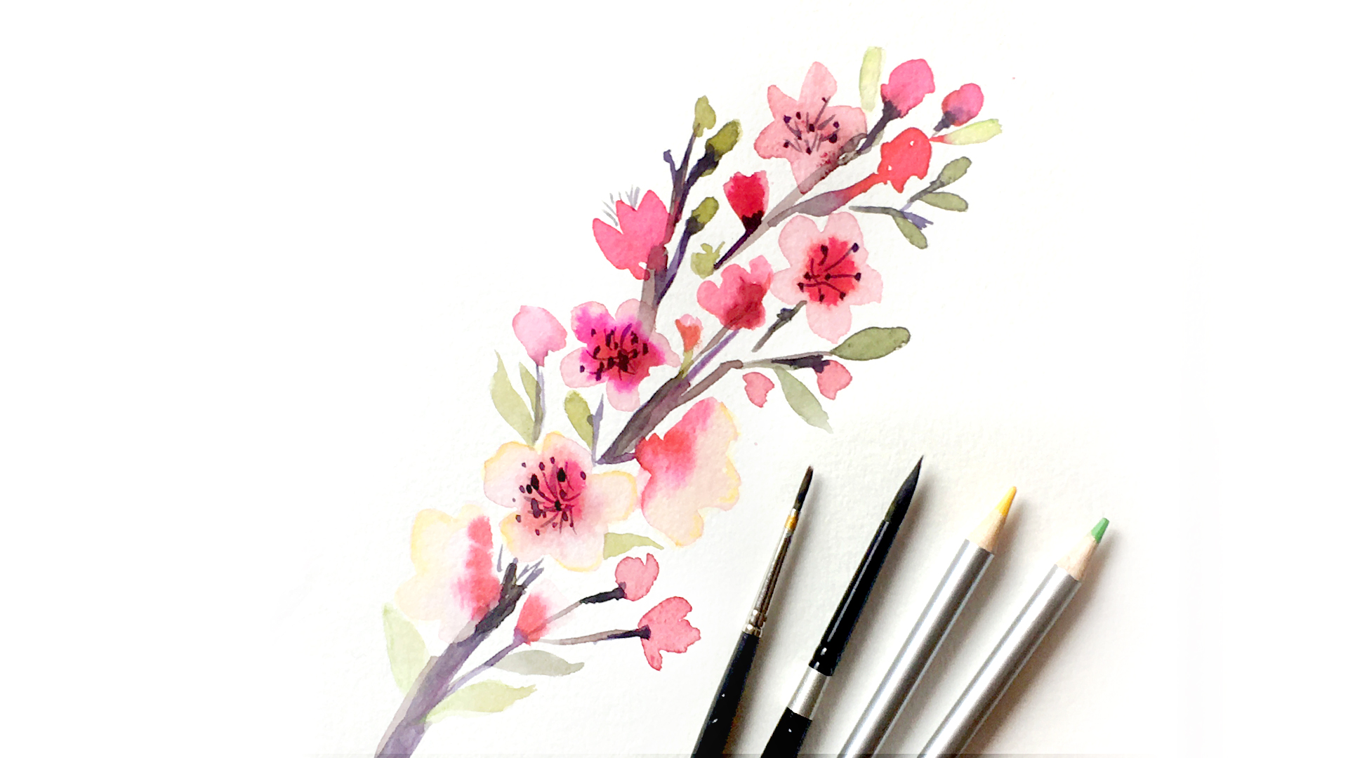
Today we are going to tackle which brushes, paints, and paper are best! If you’re just starting out, this will help you determine where you should invest your budget. This is a showdown between student and professional level supplies, where I put each category of supplies through my own test!
Paper
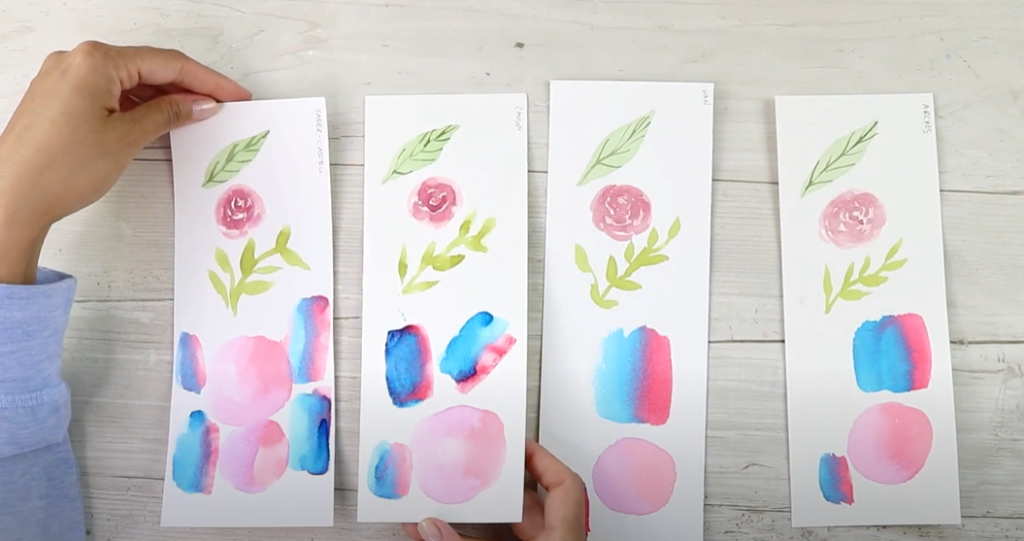
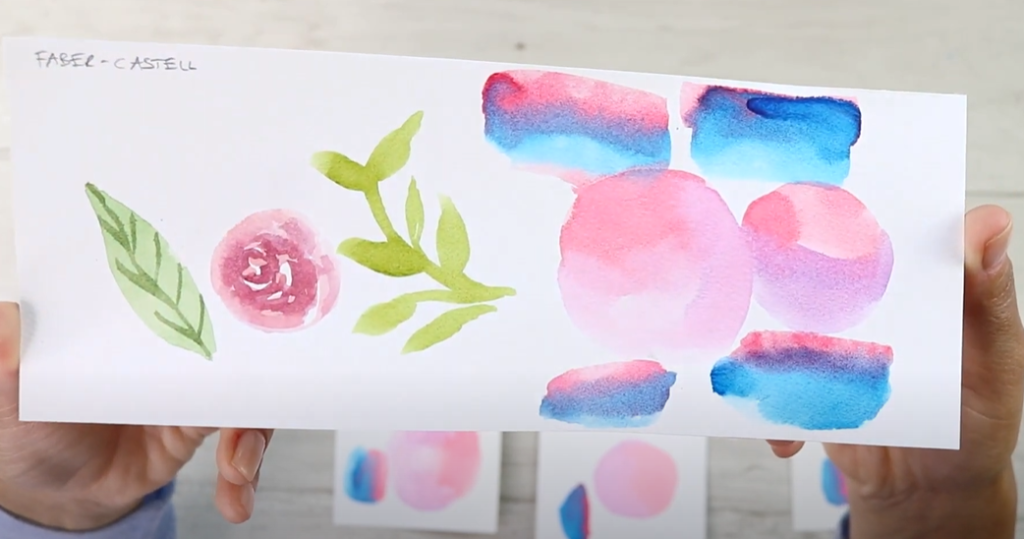
I tested two student grade brands: Faber Castel and Canson, which is a popular choice among painters. The first thing to note is that neither brand in 100% cotton. At first feel, the Faber Castel paper is noticeably thinner, and the Canson brand is thicker.
For professional level paper, I tested the brands Windsor & Newton and Arches. You can get these brands in cold pressed, hot pressed, rough, etc. The important part is that they are both 100% cotton! For both brands, the sheets are quite thick and sturdy. This means they can take quite a bit of paint and water. The Windsor & Newton is in a block format, which is sealed on the sides and helps your paper lay flat. You can use a lot of water without worrying about the paper warping. To separate your finished work from the pad, wait until it is dry. Then use a letter opener to insert into the top of the page to unseal your paper and remove it from the rest of the block. If you do get a paper that is not in a block like these, you can still use loose paper and tape it down so it stills lays flat.
In order to test all four of these brands, I tested them using both student and professional grade paints and brushes.
Paint
The first set I am using is a student grade paint set I borrowed from my son’s class. It comes with a student grade brush and plastic cover, which I used as a mixing tray.
I also am using my high-quality, professional paints. They are tube paints that have been put into the wells of a plastic, travel tray. The colors are similar when dry, but when used they behave quite differently. I have the Daniel Smith Starter Set colors in this tray as well. For more materials and supplies recommendations, grab my Free Supplies Master List!
Brushes
In contrast to the student brush, I also used two of my favorite high quality brushes. One is the Silver Black Velvet Brush and the other is the Princeton Velvet Touch Brush. The difference between these brushes and others is they are pointed round, meaning they come to a fine point at the end. This gives you some really lovely details and nice linework. You can get brushes that are not pointed, but the pointed tip will give you far more versatility for line work, large washes, etc.
Starting with the student brush, before even painting I noticed it was already starting to bend really easily and was very soft. If your paintbrush is too floppy, it will be harder to control & get the type of stokes you want. I also noticed some of the hairs falling out as I conducted my testing with this brush. In comparison, the other two higher quality brushes’ bristles are not nearly as soft & hold their shape much better. The ends also stay in a fine point when wet without getting splayed. These are signs of good quality brushes! It’s so much easier to control your paint and water when the brush snaps back into shape like these two.
A few other things you might want to keep on hand are paper towels for blotting your paintbrush, and two jars for rinsing warm and cool colors.
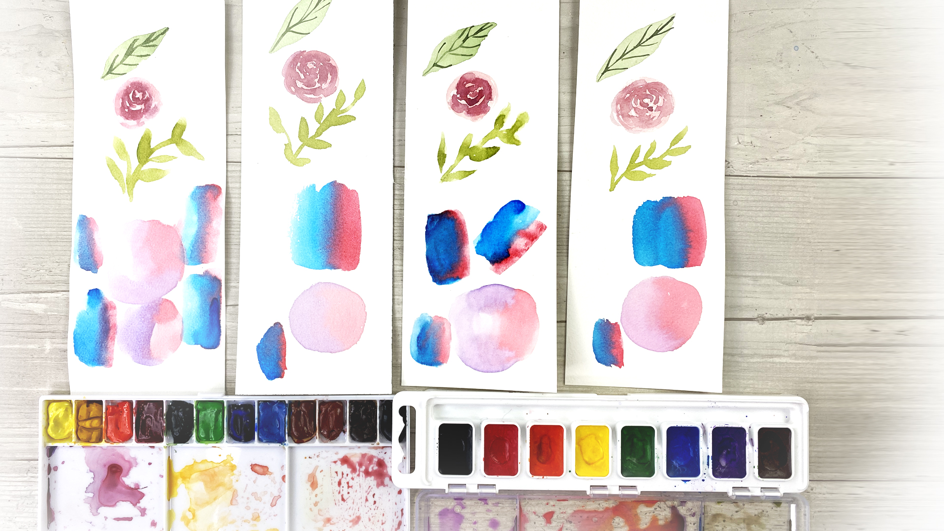
Test #1: Flat Wash
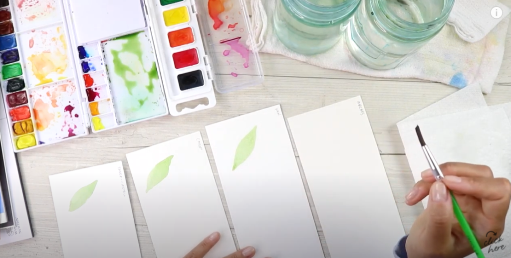
Using the Daniel Smith Paints and the student grade brush, I created a leaf shape to test for flat washes on each sheet of paper. The first difference I noticed was on the student grade paper was the edges of the leaves bleeding while they were wet, creating a hard line.
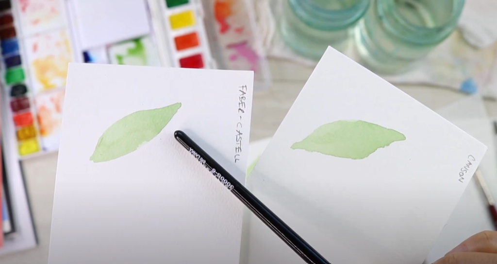
Student Grade Paper 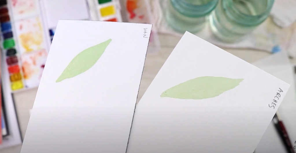
Professional Paper
Test #2: Strokes and Curves
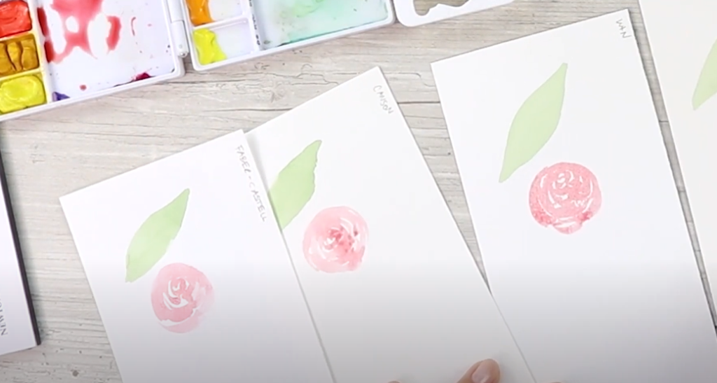
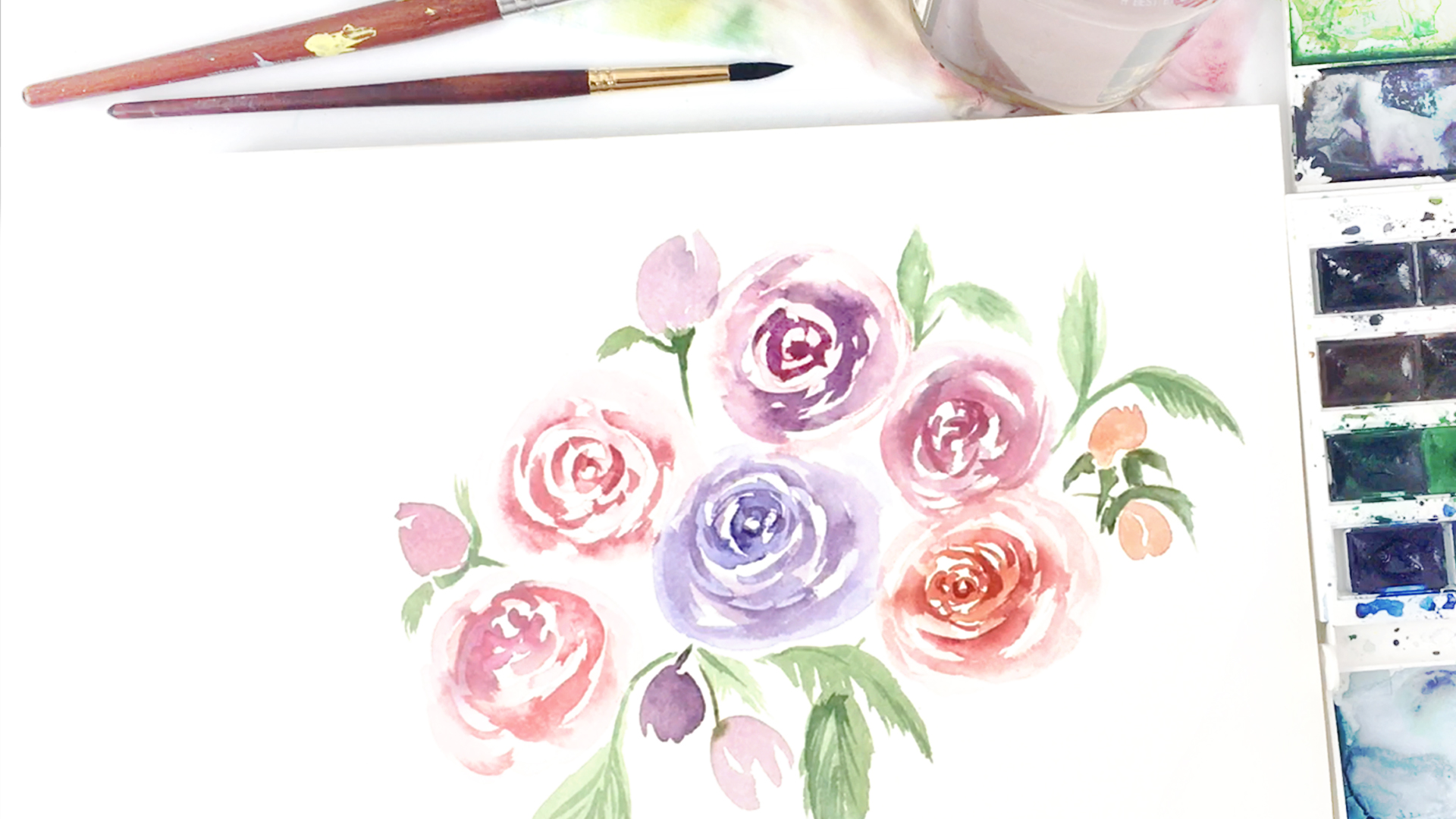
Using the Silver Black Velvet Brush and Daniel Smith Paints, I created small roses to see how the paint does on each paper. Again with the student paper, you can see some hard edges and uneven drying. On the professional page I got more even washes on the strokes.
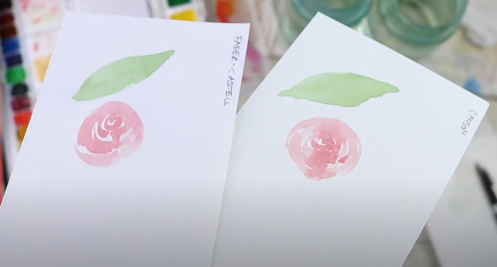
Student Paper 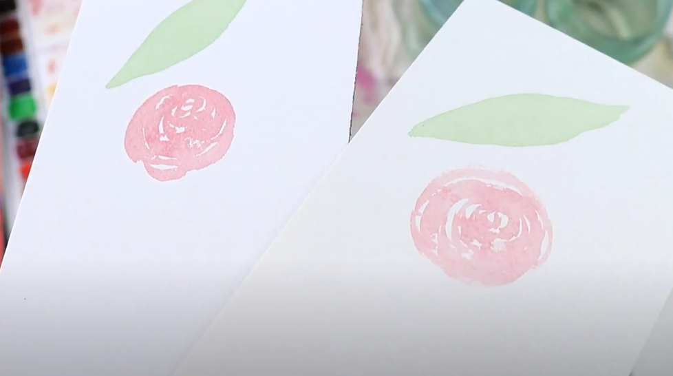
Professional Paper
Switching to Student Paints
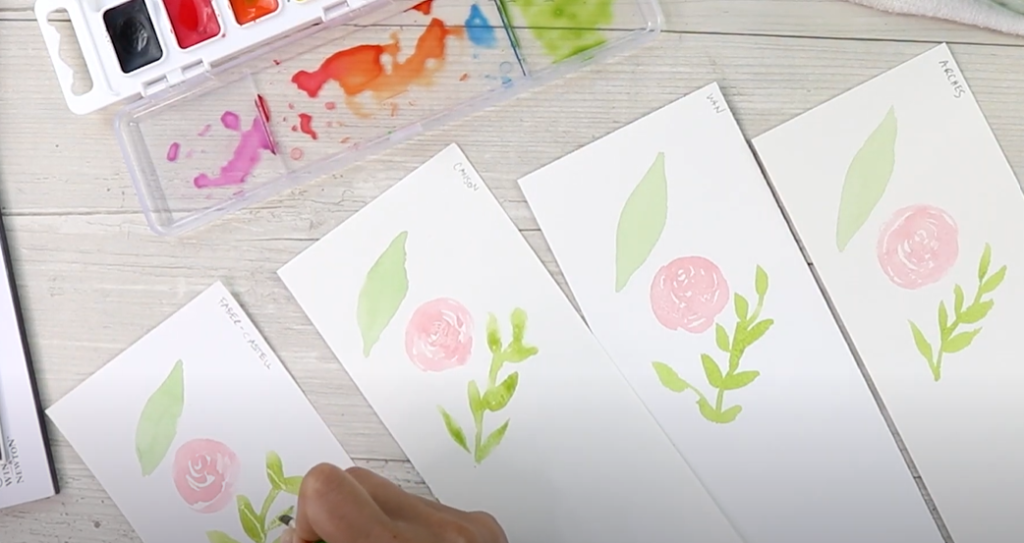
Next, I switched over to the student grade paints. The first thing to note is how bright the pigment is on these paints. I added a little bit of orange to the green to neutralize how bright it was. Using the student paint brush I created a few leaves on each type of paper. It was difficult to get the fine points with this brush, but I tried my best! Another difference with this paint that I could see is it didn’t really sink into the student paper. It sort of just glides across the top and beads up unevenly. On the professional paper, it created a more even wash, even if it was still hard to get fine lines.
Once all four swatches were dry, I compared them. The Canson paper did the worst as far as even washes on the leaves. The Faber Castle did better despite being a thinner paper than Canson! The professional papers both had nice, even washes without much difference.
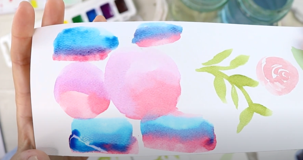
Test #3: Wet on Wet
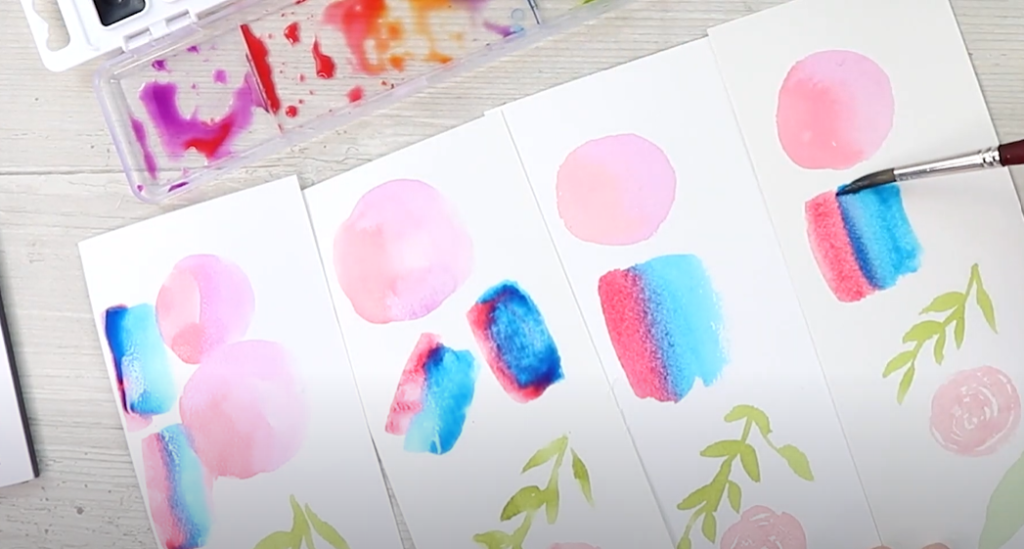
Wet on wet is exactly what it sounds like: two areas of water and paint meeting on the paper to blend. Using the Princeton Velvet Touch Brush and student grade paints, I created a split color swatch to see how the wet edges would blend together. For the first round I did red and purple next to each other, and it was difficult to see how they were blending. I tried again with red and blue strokes; they should be making a purple where they meet in the middle.
Student Paper 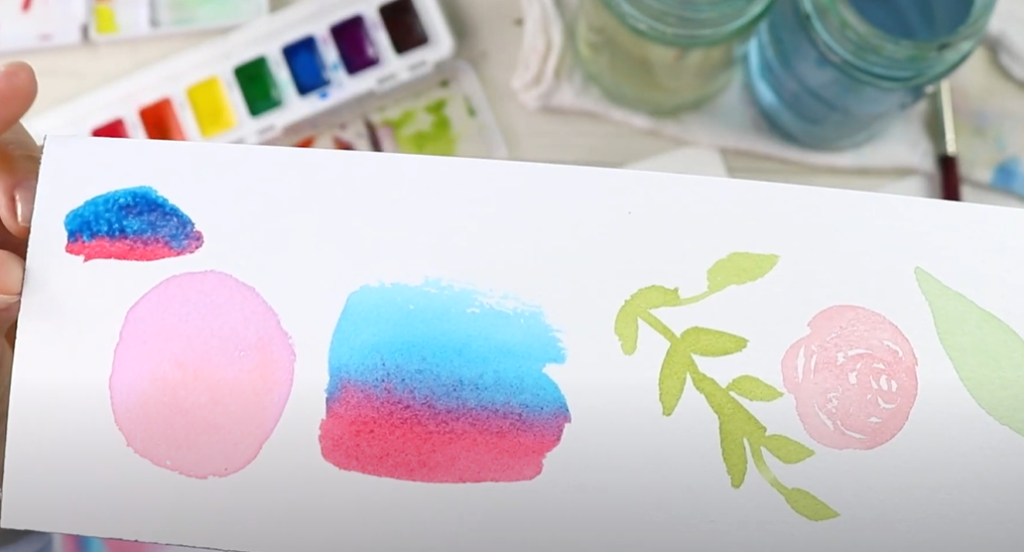
Professional Paper
I felt like the Canson paper was not doing so great. I know a lot of people love Canson, but I’ve personally always struggled with it. Here you can see the paint doesn’t mix well on the student grade papers, it just sits on top of the paper without blending much. With the professional paper, it soaks in and blends much better.
Test #4: Layers and Details
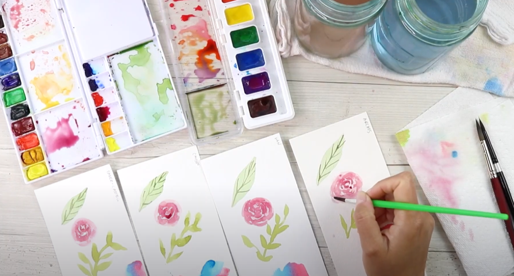
The final test is a layering test for details such as shadows or lines, where you add them on top of dry watercolors. For this test I used the Princeton brush since I am doing fine linework. I also continued using the student grade paint to add in some lines onto the leaves I painted earlier. I’m also doing a detail test with the student brush by adding some definition to our roses.
Final Results: Who is the Winner?
Now that everything has dried, let’s take a closer look.
Faber Castel 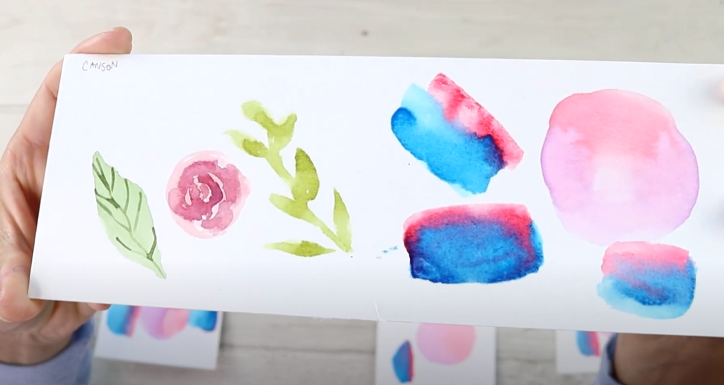
Canson 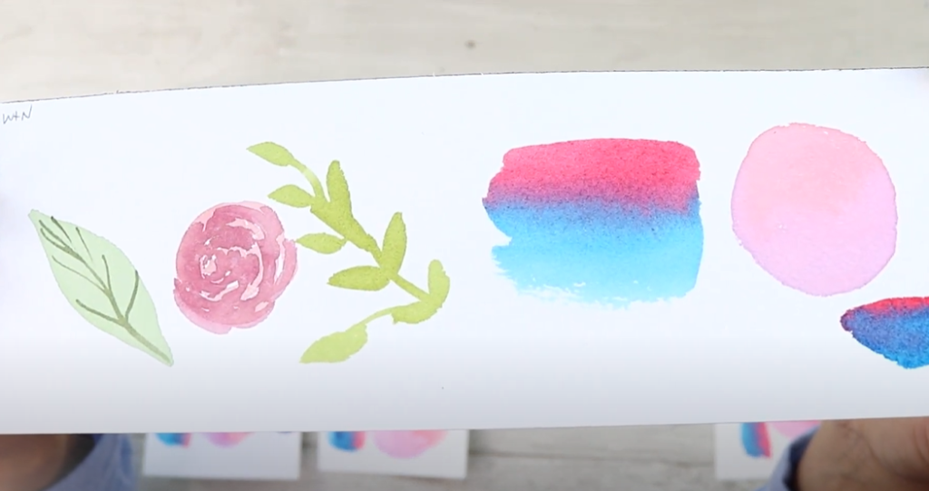
Windsor & Newton 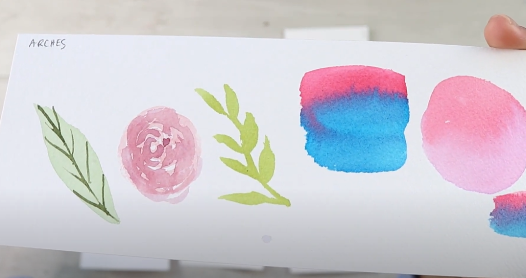
Arches
In my opinion, the professional paper blew everything else out of the water. Between the two, I don’t think you can go wrong. They both had really nice, even washes and dried evenly. Looking at the student grade papers, they’re not too bad. Between the two I would Faber Castel, because it was easier to control the paint and water on it. There is nothing wrong with student grade paper when you’re starting out; they’re great for practicing! That being said it will be a lot more frustrating when you’re trying to do techniques like wet on wet or glazing.
When it comes to brushes, I would for sure recommend investing in high quality brushes. You really only need a couple when you’re starting out; a 4-6 smaller brush and and 8-10 larger brush. If they’re pointed round brushes you can do almost everything you’ll need to with just those two brushes. The good news is it is easy to find decently priced high quality brushes, so you don’t have to break the bank!
For paint, I would say that the student grade paints weren’t bad. They tend to run a little brighter because they have a lot of filler in them. If you do want to invest in high quality tube paints, that Daniel Smith Starter Set is really great. You can also get pan sets of high quality paints. For more materials and supplies recommendations, grab my Free Supplies Master List!
If I had to invest in one high quality supply between paints, brushes, and paper, how would I pick?
- Paper
- Brushes
- Paints
I hope this was helpful for you to see all these supplies tested! If you’re just starting out I hope it helped you make some decisions on your own supplies. Don’t forget to grab my Free Supplies Master List for more in-depth product recommendations!


My #1 Must-Have Watercolor Supply
VIEW THE COMMENTS